The kitchen is undeniably the heart of the home, and designing its central feature—the cabinets—requires careful consideration of color. The art of matching colors in kitchen cabinet design goes beyond mere aesthetics; it’s about creating a harmonious space that reflects your style and enhances the overall ambiance. Let’s delve into the key principles of color matching to elevate your kitchen design.
1. Understanding the Basics of the Color Wheel
Before embarking on your kitchen cabinet color journey, acquaint yourself with the color wheel. This tool is a visual representation of how colors relate to each other. Complementary colors, located opposite each other on the wheel, create a vibrant contrast, while analogous colors, situated adjacent to one another, offer a harmonious blend. Understanding these relationships will guide your color choices and ensure a balanced design.
2. Establishing a Focal Point
Start by determining the focal point of your kitchen. Whether it’s a vibrant backsplash, a statement countertop, or a unique appliance, identifying a focal point allows you to build your color palette around it. Cabinets can either complement or contrast with the focal point, creating a cohesive and visually appealing design.
3. Embracing Neutral Tones
Neutral tones are the backbone of many successful kitchen designs. White, beige, gray, and various shades of brown provide a timeless and versatile backdrop. Neutral cabinets serve as a canvas, allowing you to introduce pops of color through accessories, backsplashes, or even bold accent walls. This flexibility ensures your kitchen design can evolve with changing trends.
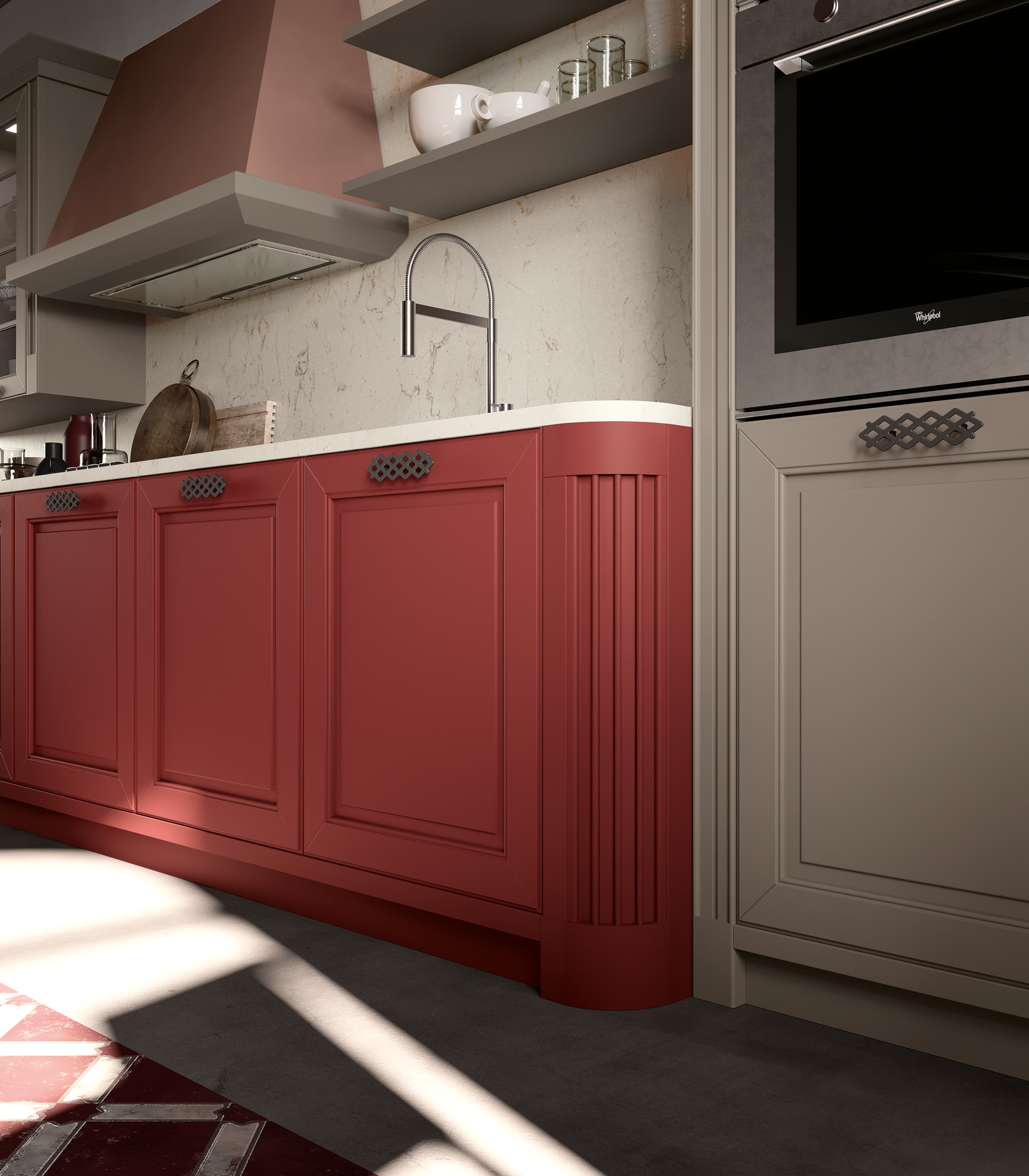
4. Playing with Contrasting Colors
For a dynamic and visually striking kitchen, consider using contrasting colors for cabinets. This could involve pairing light cabinets with a dark island or vice versa. Contrast adds depth and dimension to the space, creating visual interest. Just ensure that the chosen colors complement each other to avoid overwhelming the design.
5. Incorporating Trendy Hues
Stay attuned to current design trends but use trendy colors judiciously. Introduce fashionable hues as accents or on a single focal point, ensuring that the overall color scheme remains timeless. This approach allows you to infuse modernity without the risk of your kitchen feeling outdated as trends evolve.
6. Harnessing the Power of Monochromatic Schemes
Monochromatic color schemes involve using different shades of a single color. This approach creates a sophisticated and cohesive look, making it a popular choice for kitchen cabinets. Experiment with varying tones of your preferred color to add depth while maintaining a sense of unity.
7. Considering the Impact of Lighting
The lighting in your kitchen plays a crucial role in how colors are perceived. Natural light enhances the vibrancy of colors, while artificial lighting can introduce warmth or coolness. Test your chosen cabinet colors under different lighting conditions to ensure they achieve the desired effect throughout the day.
Final Thoughts
Designing kitchen cabinets with a mindful approach to color creates a space that is not only functional but also visually captivating. Whether you opt for a classic, neutral palette or experiment with bold contrasts, understanding the principles of color harmony will empower you to craft a kitchen that reflects your personal style and stands the test of time. Remember, the key is to strike a balance that resonates with your aesthetic sensibilities while fostering a welcoming atmosphere in the heart of your home.